A mobile application to aid families throughout the private school research and application process.
Role: Product Designer
Dates: 10.09.23 - 10.27.23
Tools: Figma, Adobe Illustrator
Dates: 10.09.23 - 10.27.23
Tools: Figma, Adobe Illustrator
THE GOAL
The goal was to take unstructured data and synthesize it to identify insights, pain points, and areas of opportunity. The outcome of the research was to create a high-fidelity mobile prototype to best serve its users.
THE CHALLENGE
The initial problem was to identify the problems that families faces during the process. Once these insights and pain points were identified, the problem became how to create an app that solved the issues of lack of information and guidance throughout the journey.
- INTERVIEWS & RESEARCH -
INTERVIEWS
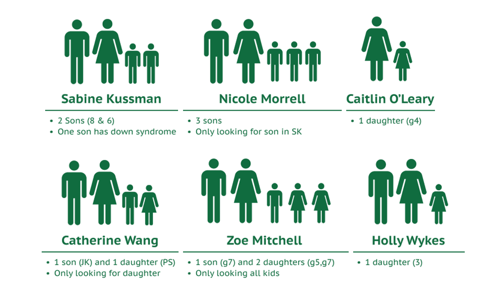
I was given 6 different transcripts from interviews with 6 individuals (all mothers) who had already gone put their children into private school. They recounted their experiences including why they went that route, the process of research and making a decision, important factors they considered, the outcomes and finally, advice they wished to bestow on parents just embarking on the journey.
AFFINITY MAPPING & INSIGHTS
After creating an affinity map, I was able to synthesize the data and draw out two main insights:
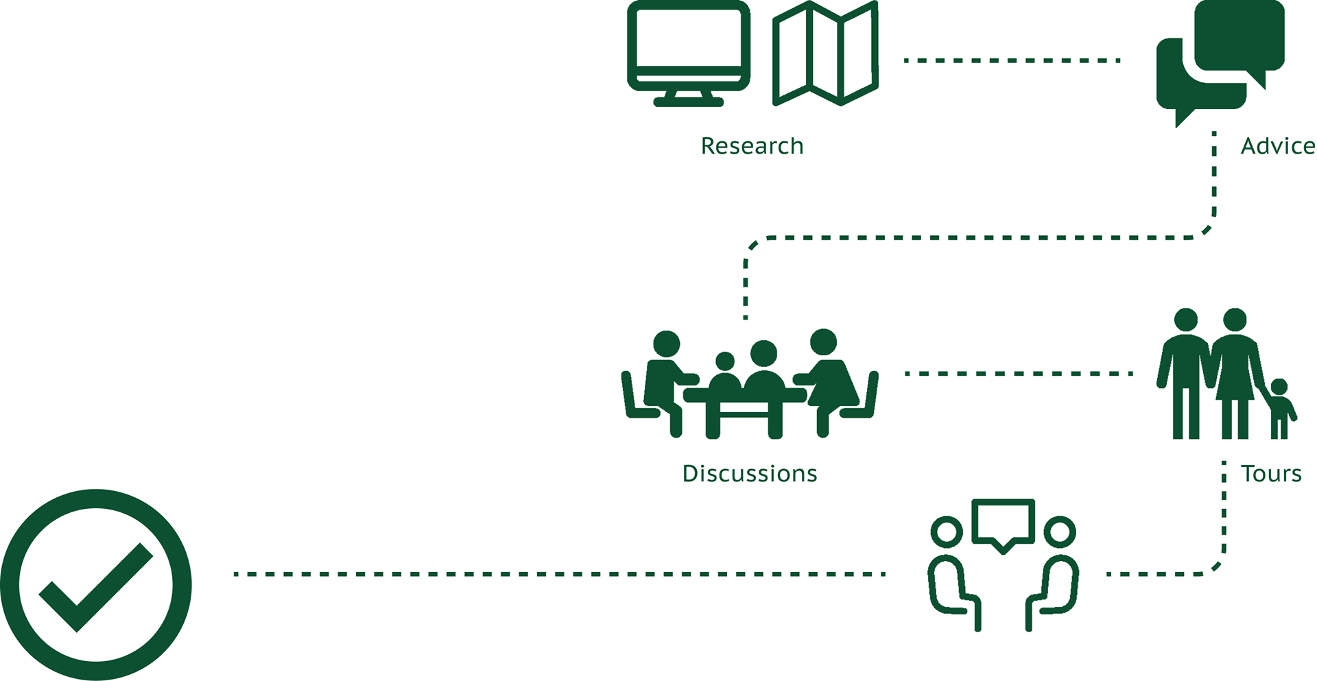
The process always differed a bit based on the number of schools, location, amount of time looking, etc., but there were always 5 consistent steps: a lot of research, seeking advice from others, family discussions, tours, and finally conversations or interviews with the school.
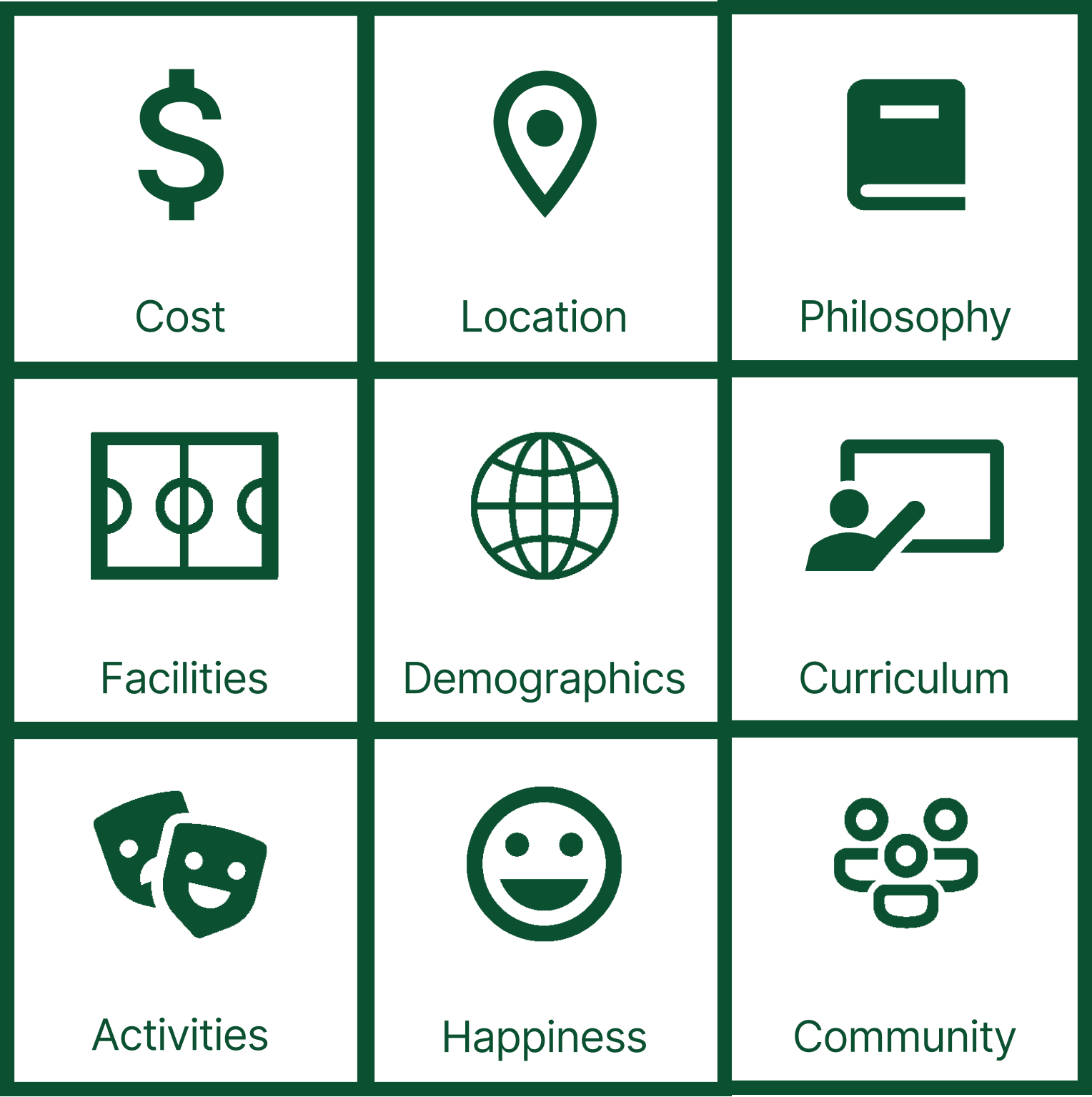
What families look for are entirely subjective to what works with their situation and it is not a one-size-fits-all model.
EMPATHY MAPPING & PAIN POINTS
From my insights, I was also able to create an empathy map, which allowed me to identify user pain points.
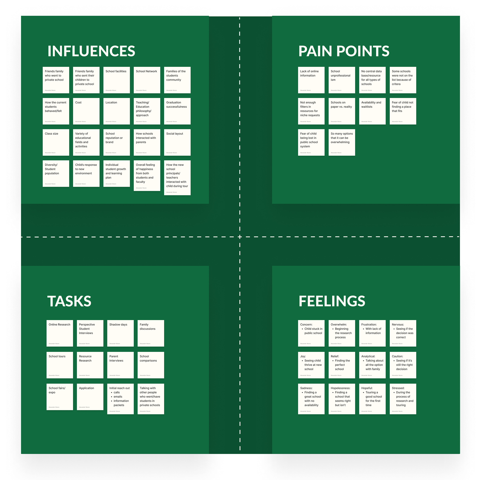
Starting: No central data base and what was available often had missing data
Researching: Too much information from too many sources and there were not enough filters to account for the diverse criteria each family was looking for.
Acting: All too often, what was advertised online or in school provided materials did not reflect the truth about what the school was offering.
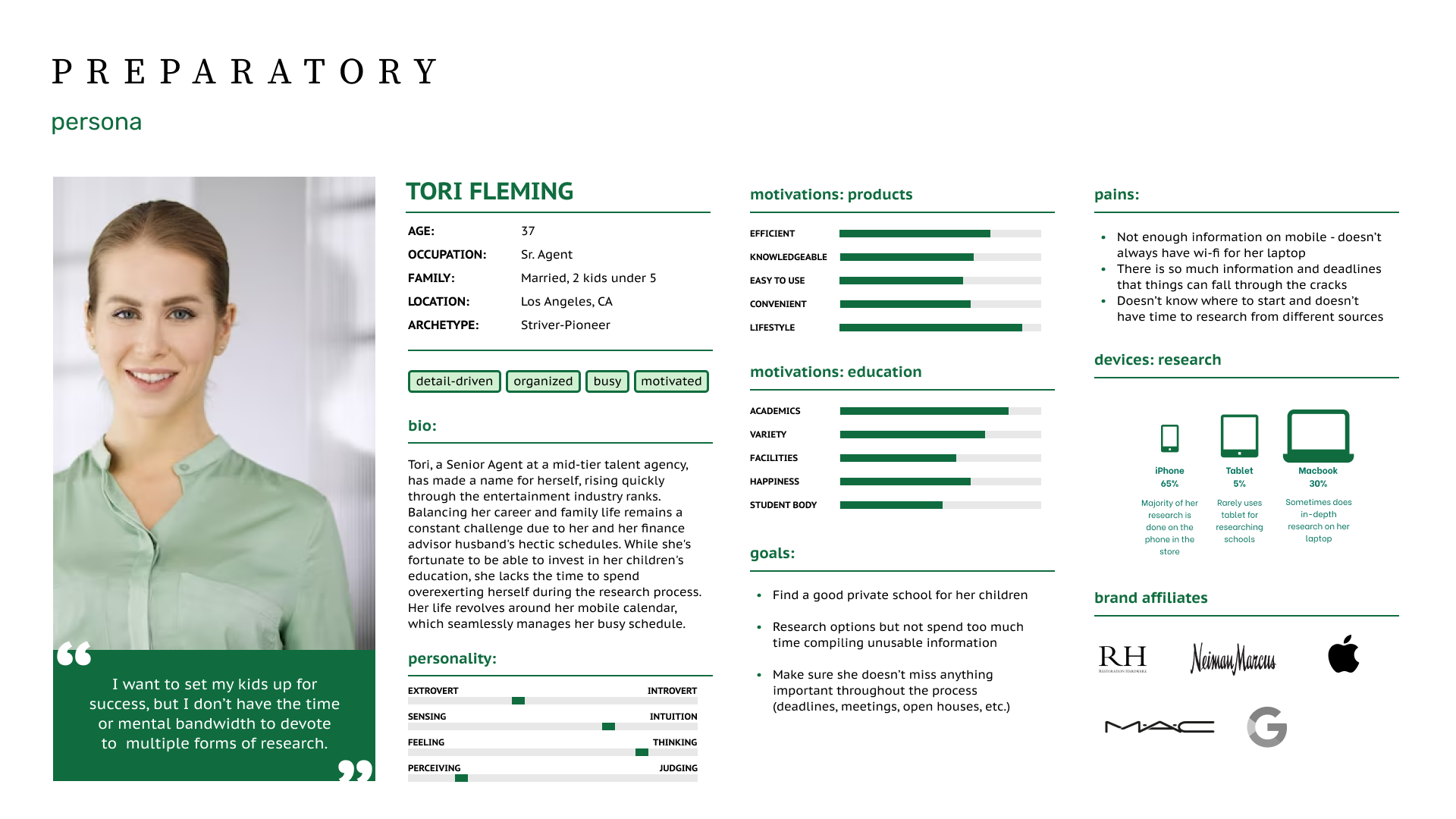
PERSONA
Once affinity and empathy mapping were concluded, I created a persona to help humanize decisions and to create a reliable and realistic representation of the key audience.
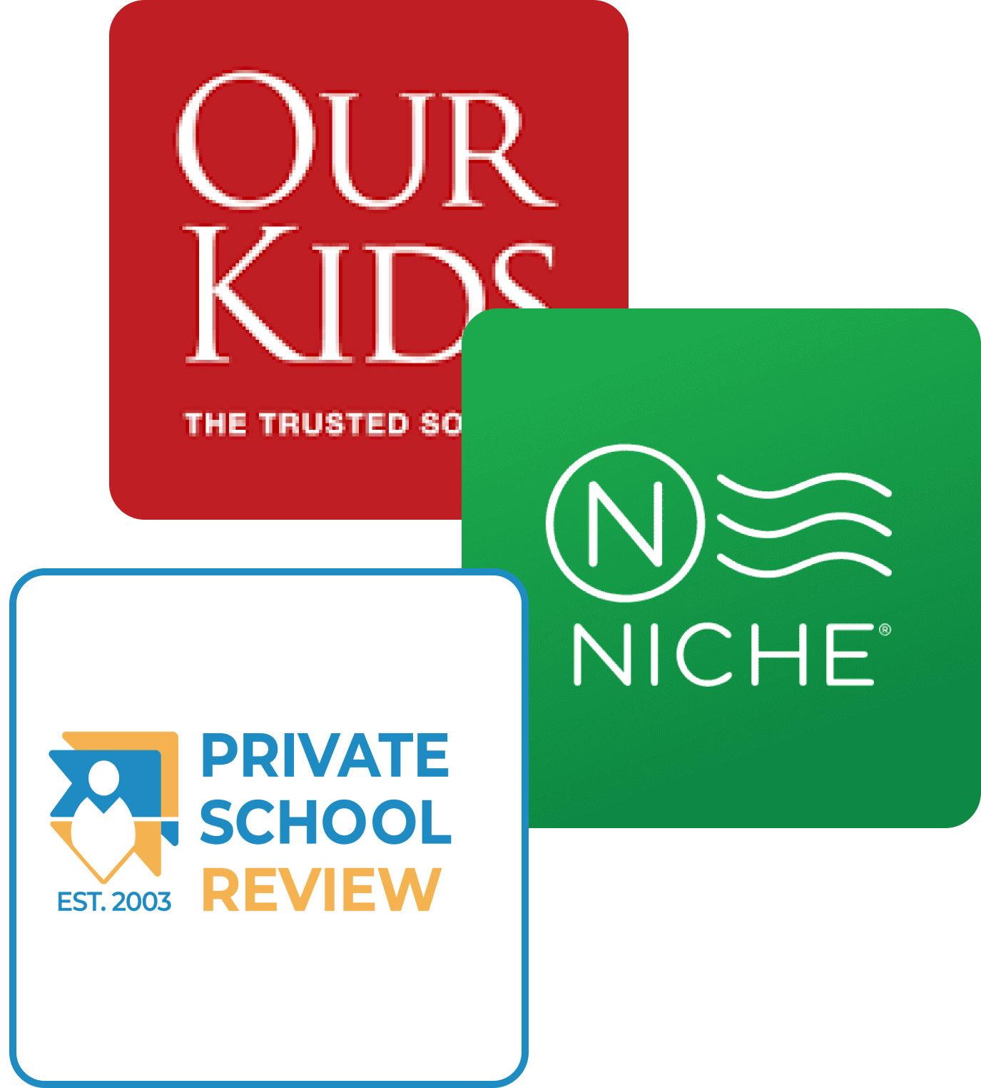
COMPETITIVE ANALYSIS
To understand what was already in the market available to users, I conducted SWOT analyses of 3 different companies: Niche, OurKids.net, and Private School Review. From this data I was able to extract positive things from each site, while uncover shortcomings that company possessed. I discovered that, while each product had its strengths, there was no platform that encompassed everything that users were looking for.
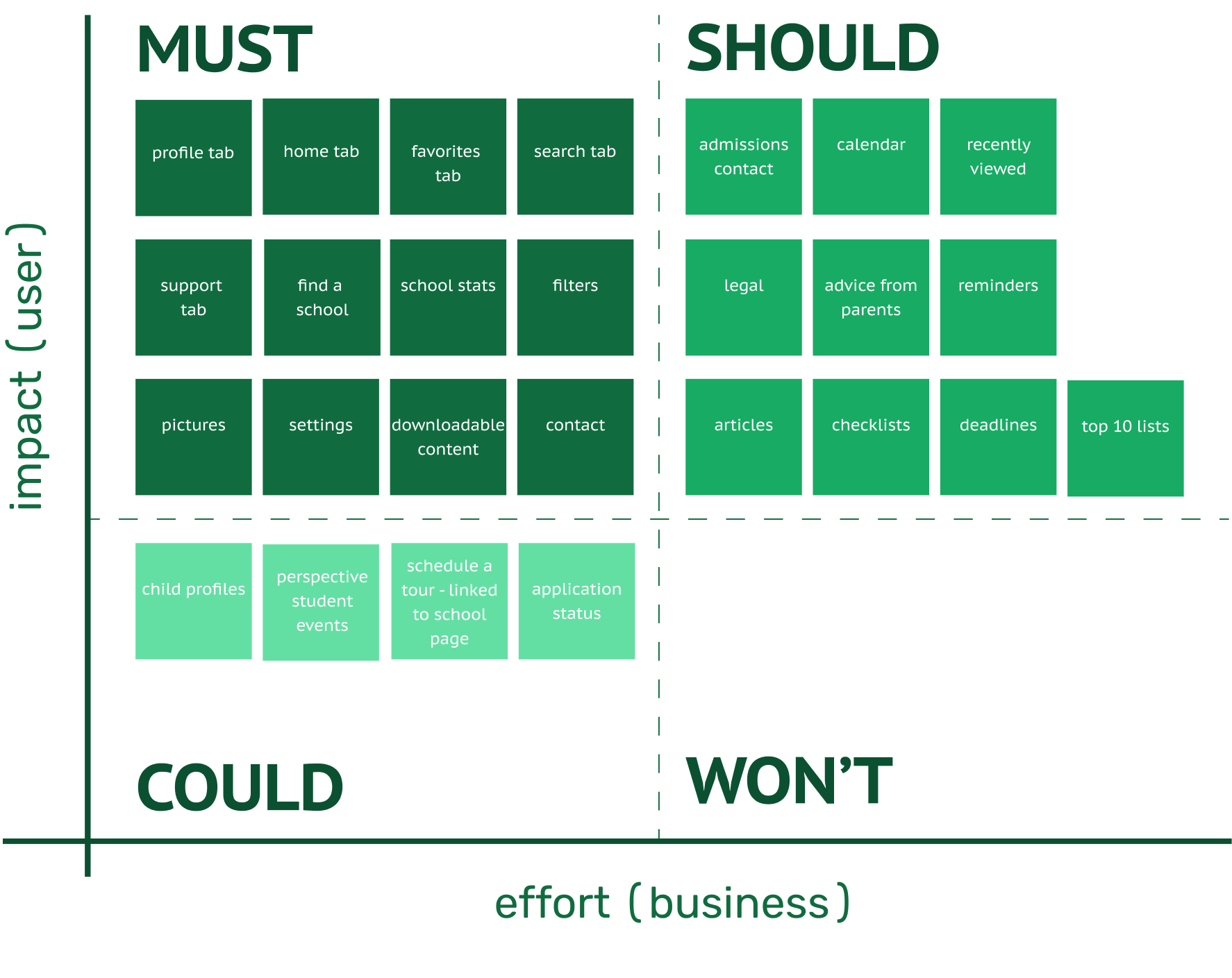
FEATURE PRIORITIZATION
Using the MoSCoW Method, I was able to prioritize what was most important to users and what could be saved for other iterations of the mobile platform.
PROBLEM STATEMENT
Preparatory wants to introduce an app for families with children under 18 going through the private school application process who are feeling overwhelmed and frustrated by the lack of information and guidance, so they can take more time to discover the educational path that best suits their child’s needs.
OPPORTUNITY STATEMENT
Preparatory wants to introduce an app for families with children under 18 going through the private school application process who are feeling overwhelmed and frustrated by the lack of information and guidance, so they can take more time to discover the educational path that best suits their child’s needs.
- SOLUTION -
Once all the data was compiled, it was clear that this product had to serve multiple functions in order to best serve its users. The solution was to create an mobile application that was equal parts information and guidance.

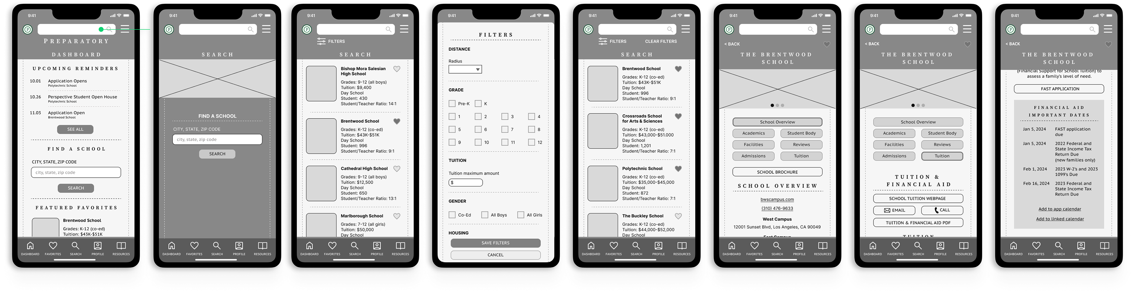
WIRE FRAMING & USABILITY TESTING
A prototype usability test was created to test navigation by giving participants a task flow scenario to perform. This task came in two parts, one to preview filters and the other interactivity within the app. To measure success, we used scenario completion, scenario completion time, and non-critical errors.
Task 1: Select a school from a list on only co-ed day schools that accepted kindergarten students
Task 2: Co into one of those schools from the list in task 1 and add the financial aid dates to their in-app calendar
Results: While subjects all finished both tasks, it did however reveal some initial issues with the iteration. Unclear buttons and labels within the school page led to some hesitation and time being wasted. From these results, changes were made within the wire framing to better direct users.
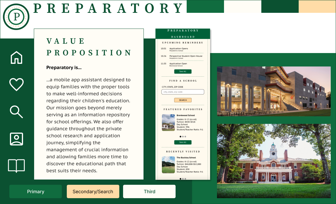
ART DIRECTION
I wanted the feeling users got when interacting with the product to be something familiar with the heir of authority and intelligence.
I created a visual design that introduced color theory, using greens to inspire growth and ivory to elicit calmness, while typography evoked a memory of sitting in a library and filling the users head with information. The layout itself was meant to vaguely resemble a piece of notebook paper.

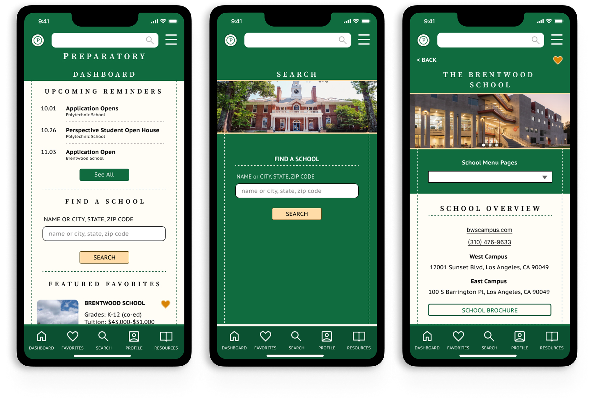
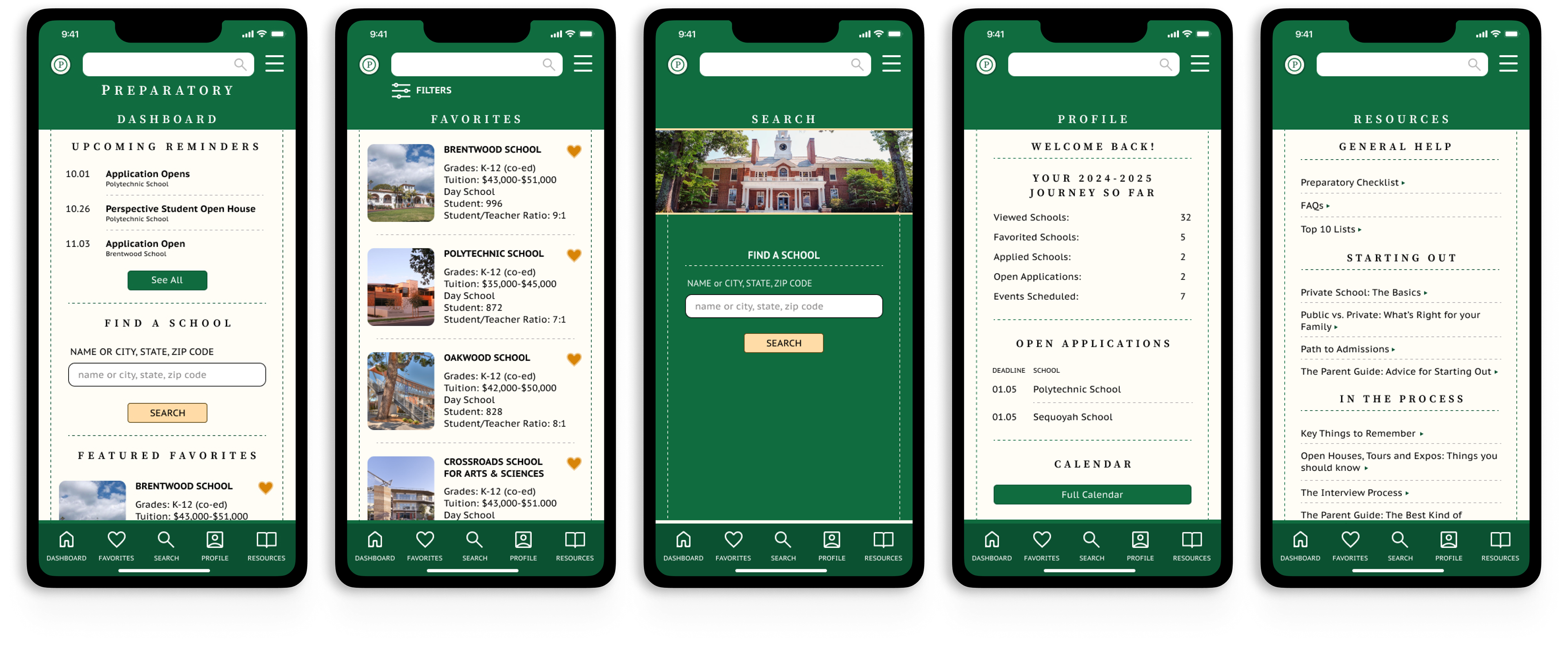
HIGH-FIDELITY PROTOTYPING
RECOMMENDATIONS
From this high-fidelity prototyping, my recommendations would be to continue user testing, both with content and navigation. It would be important to see if all user pain points were addressed in this iteration or if any newer ones came up. Because this is a complicated application with many different moving parts, it is also worth it to ensure that navigation and usability are still improving.