An AI assistant mobile application that helps users with their writing.
Role: Product Designer
Dates: 10.09.23 - 10.27.23
Tools: Figma, Adobe Illustrator
Dates: 10.09.23 - 10.27.23
Tools: Figma, Adobe Illustrator
THE GOAL
The goal was to take information provided by the client and create deliverables including a high-fidelity marketing page formatted for mobile, tablet and desktop, as well as a high-fidelity prototype of the mobile platform.
THE CHALLENGE
The challenge for the marketing page was to prioritize important bits of information from the company to best entice potential users to sign up for this service. The challenge for the prototyping create a user-friendly product that won’t overwhelm users who are unfamiliar with AI.
••• MARKETING PAGE •••
PROBLEM STATEMENT
Users who don't know about HAYDN need a quick and easy marketing page with details and app features, so that they can decide if they want to sign up for the platform.
- RESEARCH -
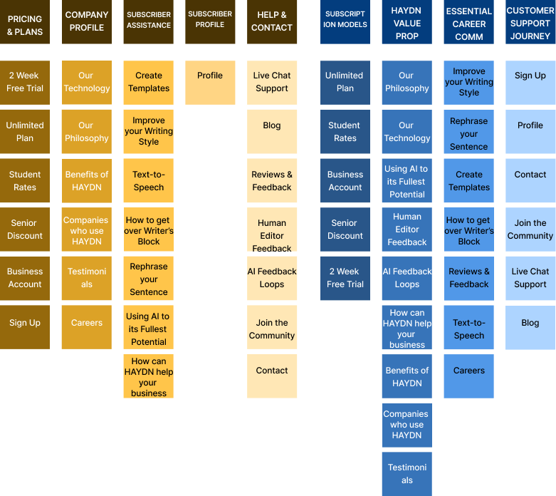
DATA EXTRACTION & CARD SORTING
The client supplied snippets of web copy extracted from their own website, which were intended to serve as the foundation for the marketing page and, ultimately, the mobile application. I used this text to pull essential content to be incorporated into the new platforms.
Since these features were sourced from written content rather than an established product , it was crucial to organize the data so it was both user-friendly and logical. To gain insights into the thought process of potential consumers, I opted to conduct an open card sort, enabling me to observe how participants naturally grouped features, as well as what titles they would give to said categories.
Results: Both users, chosen from different backgrounds and demographics, separated the content into similar groupings. The names did differ, as one participant had a tech marketing background, while the other used more "everyday" terms.
SITE MAPPING
From the information learned from the card sorting, I began to create a site map. This would prove useful for not only the menu header, but also as I started to build out the mobile app.
- SOLUTION -
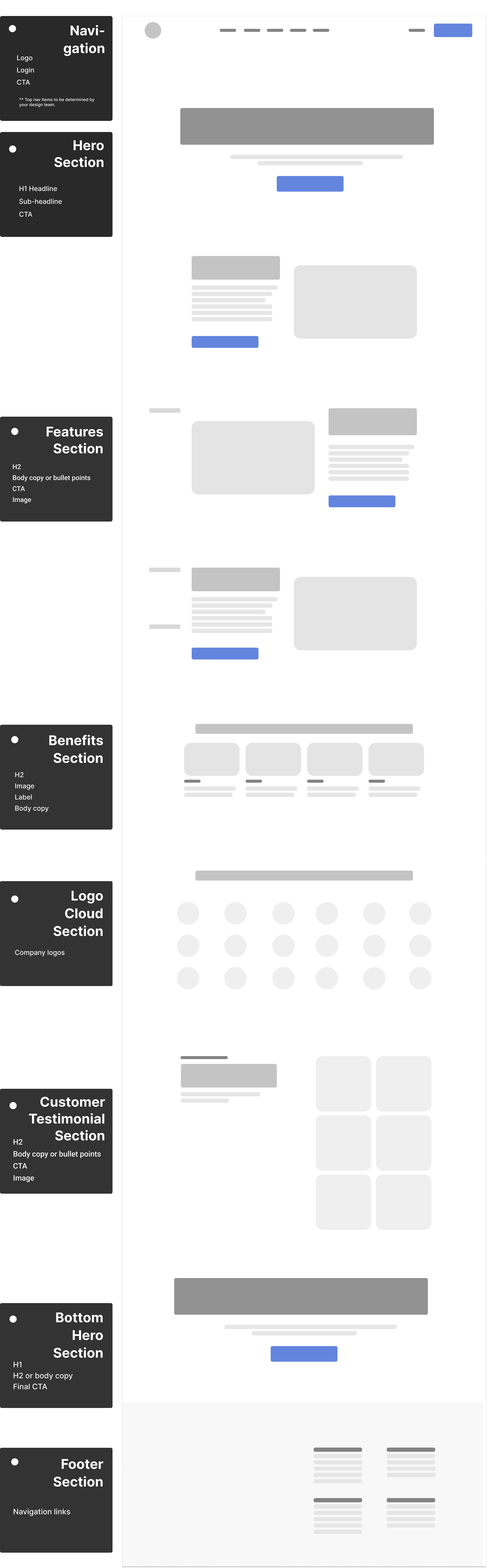
MID-FIDELITY WIRE FRAMING
The client provided a basic low-fidelity mockup in order to show what sections they were looking for in their marketing page. Using this as a loose guideline, I created a mid-fidelity mockup.

ART DIRECTION
Because AI is a growing field and a new frontier for so many people, I wanted HAYDN to feel modern and clean, while still remaining tangible, to reassure nervous users that at it's core, this is about writing. Taking the principles of Material Design, I created stacked layers of "paper" to remind customers what the purpose of the app is for.
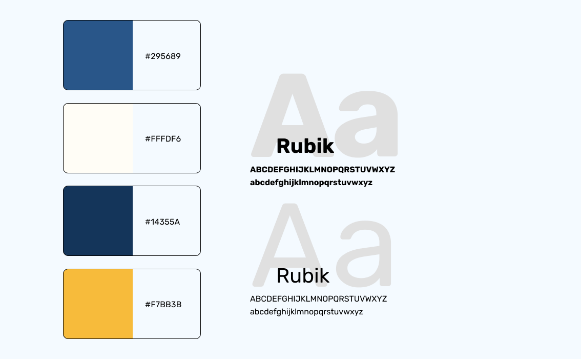
The client provided typography for the project, along with 9 different colors that the brand used. I chose to focus on different shades of blue (confidence, calm, and stability), ivory (quiet and pleasant) and accents of Sunflower Gold (joy and brightness). For imagery, the client emphasized using photography that showcased the diversity that they looked for in their own clientele.
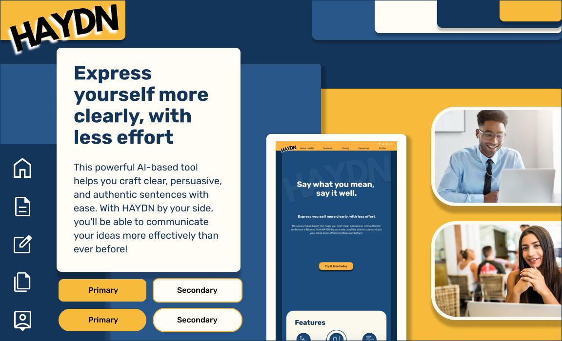
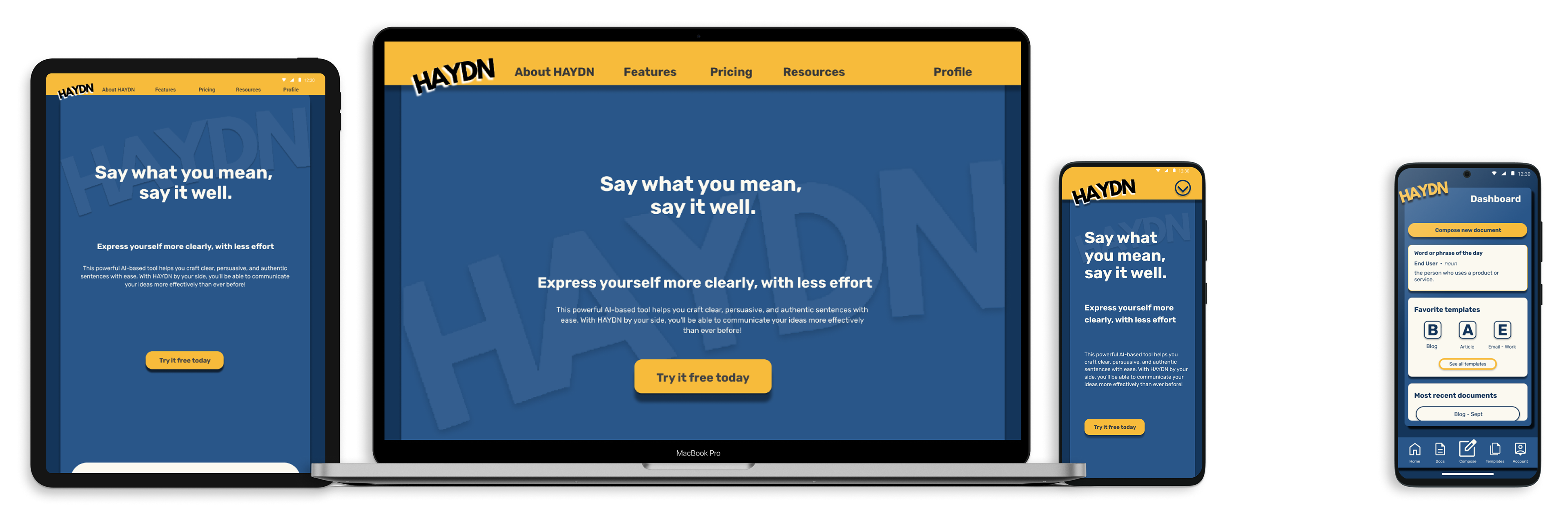
HIGH-FIDELITY MOCKUPS
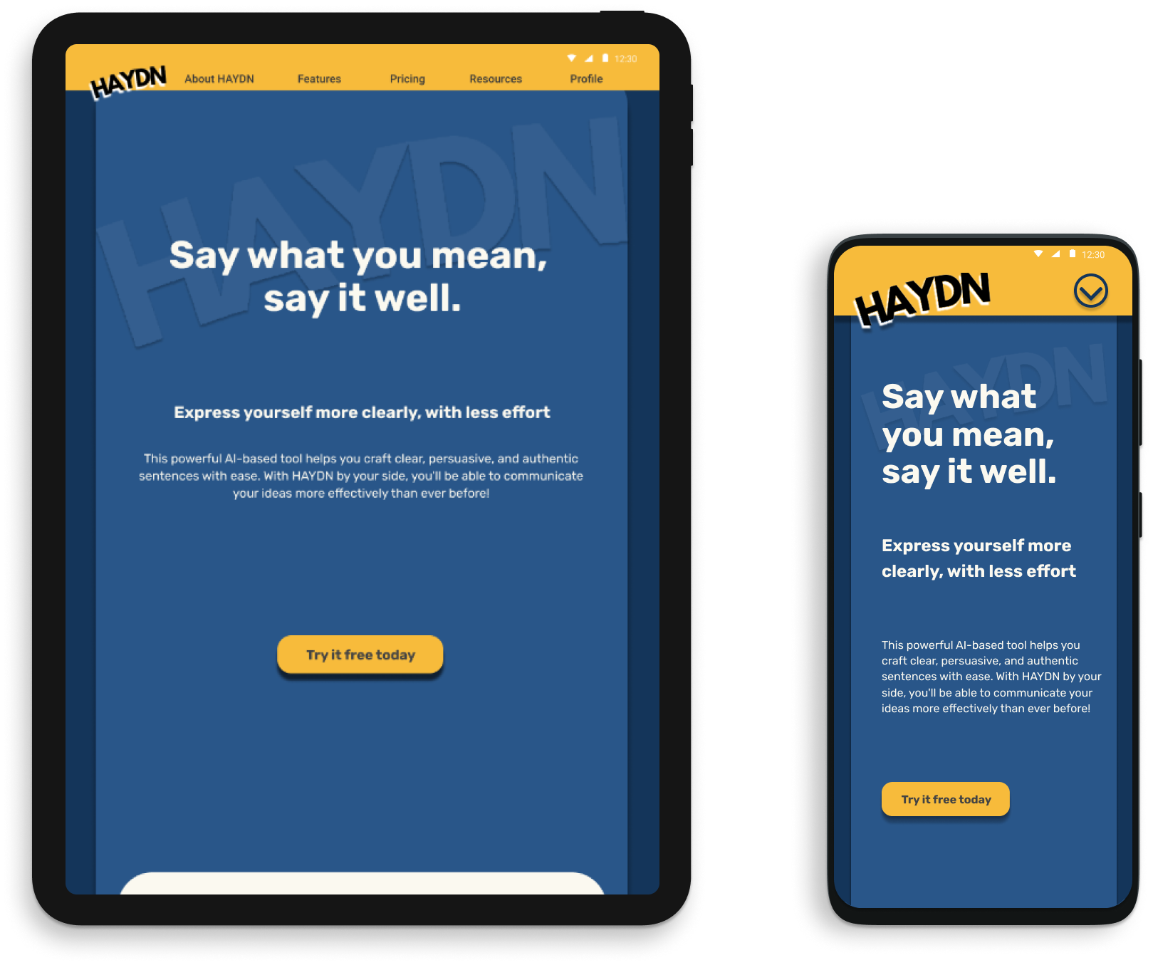
While the marketing page was designed for a desktop, as a mobile app product, it was important that the webpage be flexible enough to be accessed on tablet and mobile as well.
••• MOBILE APPLICATION •••
PROBLEM STATEMENT
HAYDN wants to develop an app where new users to AI tools aren’t faced with initial navigational or intuition problems that would dissuade them from using the app and realizing all of its capabilities.
OPPORTUNITY STATEMENT
AI is still a brand new resource that many people are unfamiliar with, with only a few tools readily available and used by the public. By introducing a new technology into the market, HAYDN can not only improve the writing skills of its users, but can also educated them on the possibilities of this newest frontier.
- SOLUTION -
HIGH-FIDELITY PROTOTYPING
Using the visual design created for the marketing page, I continued the theme into the mobile app to maintain consistency.

USABIILITY TESTING
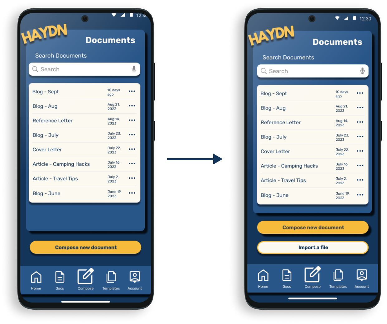
Once prototyping was finished, I wanted to begin user testing more to see if the product I designed was viable. I chose to conduct a first-click test to measure initial thoughts of participants without allowing for any second guessing; If everything was made successfully, then the results will reinforce this.
Results: Out of the 10 tasks given, both participants got 9/10, missing the "Import a File" task. Initially, it only lived in the "Compose" tab, however both chose to click "Docs." Because of this, I added in an "Import a File" button to the Documents Tab, which can be seen in the prototype.
RECOMMENDATIONS
Next steps in the process would be more usability testing. I would recommend prototype and tree testing so that tasks involved more steps. To do this, it might require more prototyping.