An delivery app for the hungry college student
Role: Product Designer
Dates: 08.89.23 - 11.03.23
Tools: Figma, Adobe Illustrator, Adobe Photoshop
Dates: 08.89.23 - 11.03.23
Tools: Figma, Adobe Illustrator, Adobe Photoshop

THE GOAL
The goal was to create an innovative and user-centric food delivery app that stands out in the market, offering seamless, efficient, and delightful experiences for customers seeking quality food and grocery delivery services. The deliverables included designing a logo, creating a high-fidelity marketing page mockup, a 404 missing page, and prototyping a high-fidelity mobile app.
THE CHALLENGE
The initial challenge for this product was to pinpoint its distinct value proposition. Once that was established, the subsequent challenge involved crafting both a brand and product that mirrored this value proposition, all the while upholding a user-centric and intuitive design.
- RESEARCH -
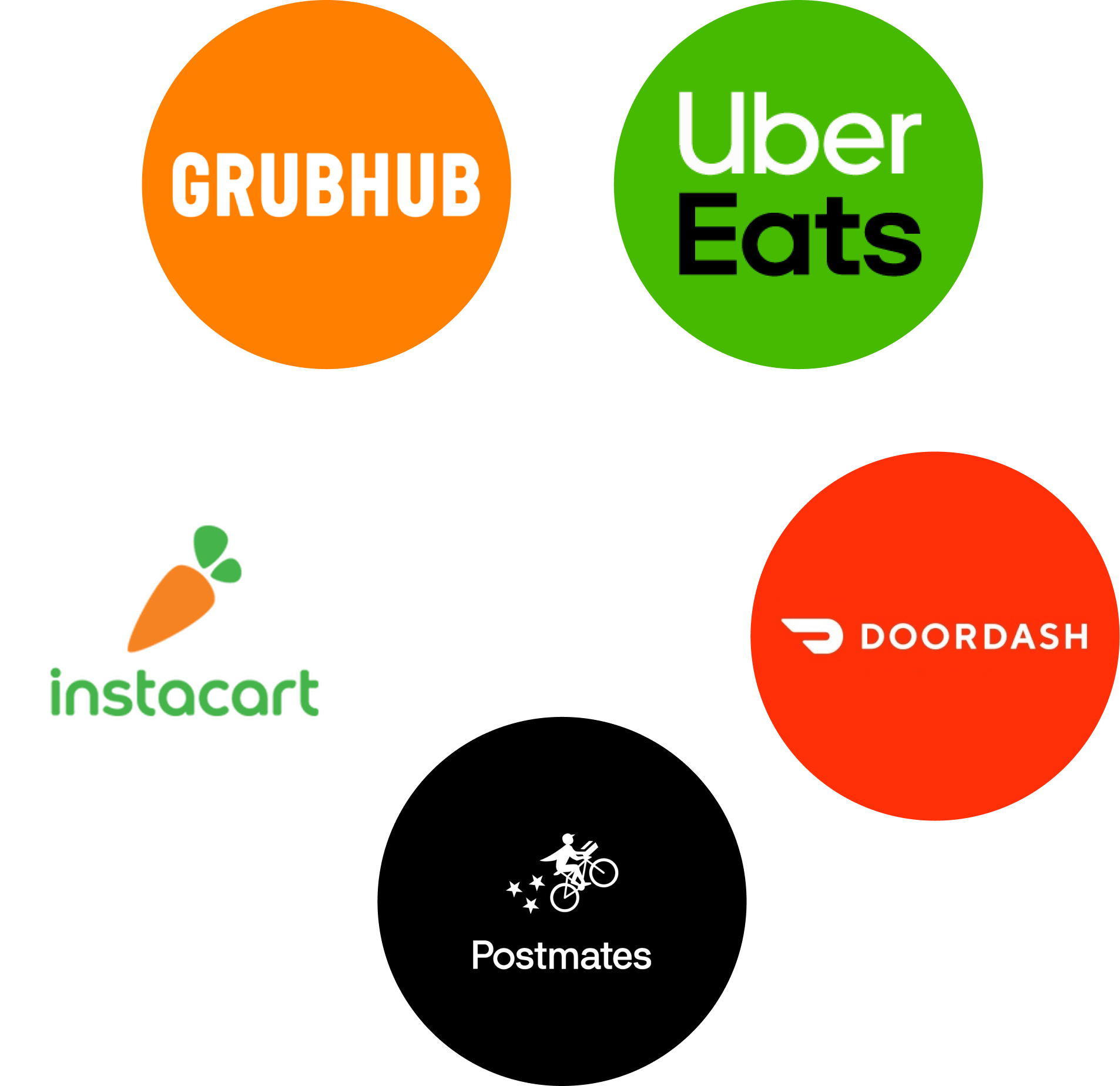
COMPETITIVE ANALYSIS
To determine the app's position in the market, I initiated the process by conducting a competitive analysis of the top five food and grocery delivery services currently in use: Grub Hub, Uber Eats, DoorDash, Postmates, and Instacart. My research involved dissecting each company's pricing structures, delivery times, membership fees, and their approach to addressing concerns such as allergies and sustainability.
My discoveries, although valuable in understanding the market, revealed that, for the most part, these companies bore striking similarities. While users certainly had their preferences, there was a lack of truly distinctive features setting these companies apart. This analysis did allow me to begin to form a feature list, based on what was successful from these 5 companies.
OPPORTUNITY STATEMENT
Examining the competitive landscape, it became evident that my value proposition had to revolve around an aspect not receiving significant attention from other companies. With this product, I opted to place a stronger emphasis on the target audience, as existing platforms were casting an exceptionally wide net.
Given the widespread accessibility of technology among the younger generations, I recognized a substantial opportunity when targeting college students. This niche demographic possesses distinct characteristics, with a blend of freedom and relatively fewer responsibilities, often making impulsive decisions without bearing the full weight of financial consequences. They also tend to have a perpetual appetite while lacking access to a kitchen for cooking. Moreover, local businesses thrive due to the revenue generated by this demographic.

PERSONA
I created a persona in order to guide my decisions throughout the UX and UI Design process.
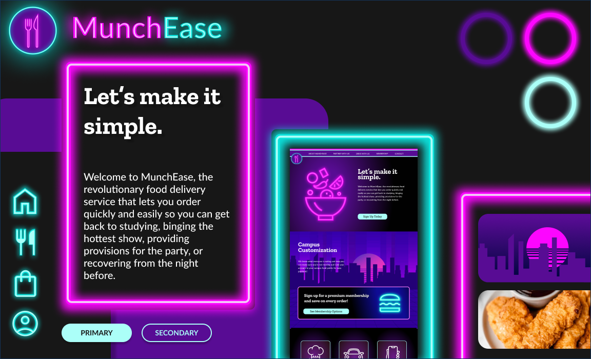
••• MARKETING PAGE •••
PROBLEM STATEMENT
College students who are already familiar with delivery apps or are choosing one to download need to understand the value proposition of this platform, so they can download an app that is tailored to their specific needs.
- SOLUTION -
NAMING
After formulating the opportunity statement, the next step was to select a name for the product. Since the platform is aimed at college students, I wanted a name that would capture the carefree lifestyle of the intended user, while prominently featuring the user-centric app functionality.
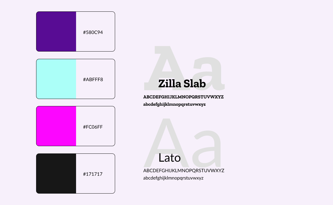
ART DIRECTION
Since college hours are more nocturnal than other periods of life, and a large market for the app would be awake at later hours, I wanted to continue that energy throughout the platform.
I created a visual design that mimicked neon lights, with their bright colors and excitement. The palette of bright magenta and teal popping on deep purple background evoked feelings of fun, frivolity, and excess. The uniformed typography brought structure and realism to the boundaries of neon sign making.
HIGH-FIDELITY PROTOTYPING & MOCKUPS
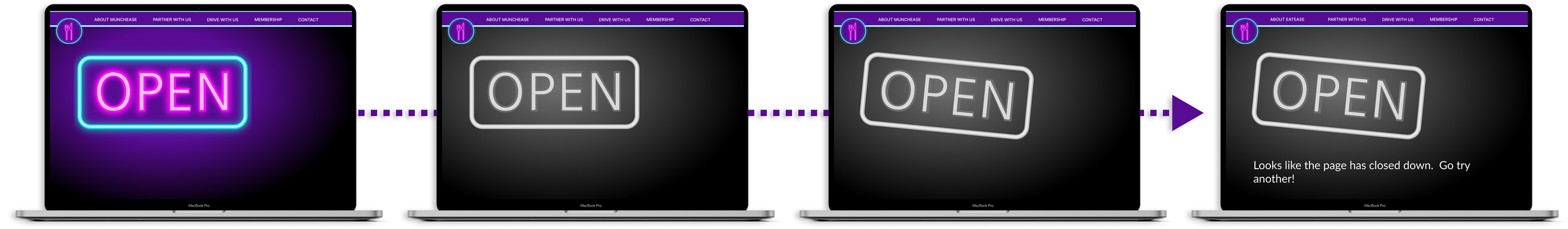
404 Page Keyframes
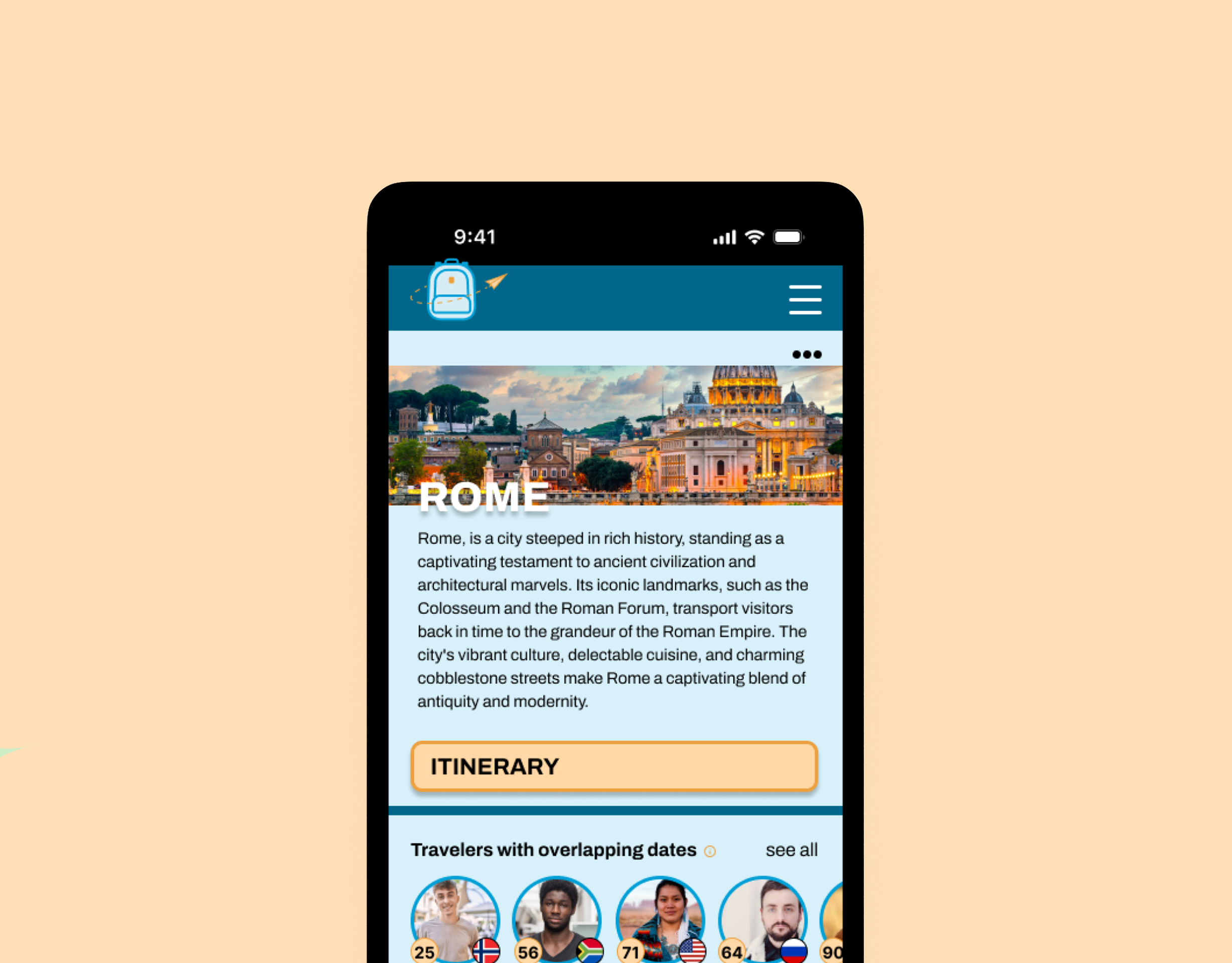
••• MOBILE APPLICATION •••
PROBLEM STATEMENT
College students need a food and drink delivery platform that highlights late night food and is connects schools and local businesses, so that they have food delivered efficiently whenever they want it without worrying about their finances.
- SOLUTION -
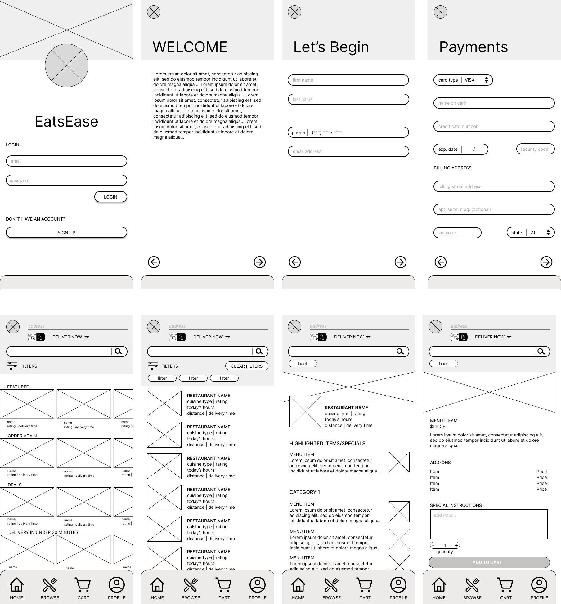
I began designing the mobile app using mid-fidelity mockups so I could start to understand how the platform would move and navigate. Despite having a general idea of color palettes and typography, I didn't want to that to bog down this process, as it was something to be taken under consideration later on when moving to high-fidelity prototyping.
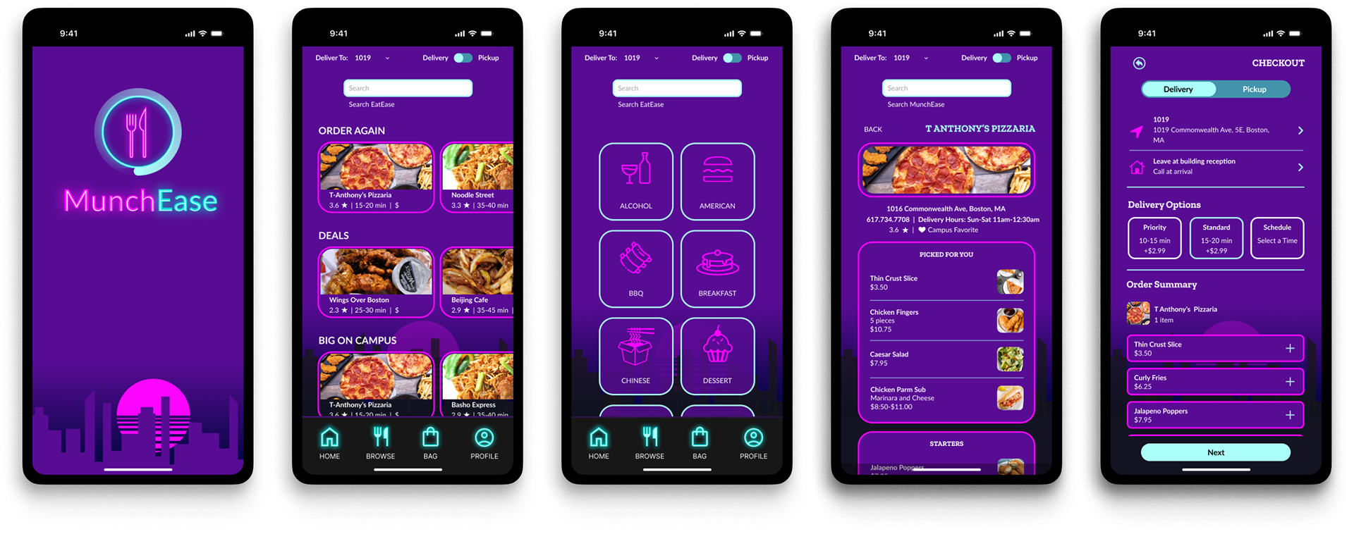
HIGH-FIDELITY PROTOTYPING
RECOMMENDATIONS
Next steps in the process would be to conduct usability testing, focusing on navigation. This would include first-click tests and prototype testing. From these results, changes could be made and newer iterations would be tested again.