
A mobile app that encourages socialization between solo travelers while abroad
Role: Product Designer
Dates: 11.06.23 - 11.16.23
Tools: Figma, Adobe Illustrator
Dates: 11.06.23 - 11.16.23
Tools: Figma, Adobe Illustrator
THE GOAL
The objective was to innovate and develop a unique product by leveraging self-conducted research to address a problem identified during the research phase. The outcomes encompassed the creation of a distinctive logo and a high-fidelity prototype aimed at resolving the challenges users encounter within the specified domain.
THE CHALLENGE
The initial hurdle involved conceiving an original product idea and confirming its market viability. Following preliminary research and finalizing the concept, the challenge shifted to conducting various research forms to address a specific user problem. Ensuring that all solutions were user-friendly and effectively tackled the identified issues became a central focus.
- RESEARCH -
PRE-RESEARCH
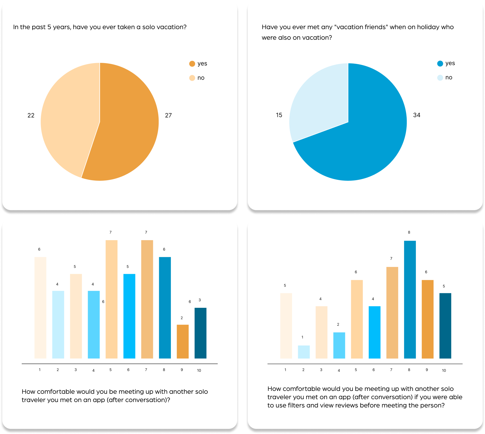
Before embarking on this product, I had to see if if there was a viable market. Conducting a survey among 49 participants yielded surprising results. Out of the respondents, 27 had previously embarked on solo trips, surpassing my initial expectations. Even among those who hadn’t gone alone before, 34 people had made connections and created “vacation friends” during their travels. Furthermore, the results showed that more people would be more comfortable meeting a fellow solo traveler on an app if there were filters and verifiers in place.

DOMAIN RESEARCH
To ensure my data was not skewed by my participants, I needed to see if solo travel was a more universal activity. I learned that 11% of all travel is done by solo travelers and that interest levels and bookings have risen since even before the pandemic.
INTERVIEWS
I conducted interviews with two enthusiastic travelers, one man and one woman. The interview covered topics ranging from their current travel routines and planning processes to the highlights and challenges of solo travel. We delved into how they typically connect with people during solo trips and explored their primary concerns when navigating destinations without companions.
AFFINITY MAPPING & INSIGHTS
From these interviews, I was able to organize the information through affinity mapping into 6 different categories: travel history, prepping for travel, the motivations, positives, and negatives of solo travel, how to meet people when on a trip alone, using apps specifically when wanting to meet others, and finally, general travel app habits.
From the affinity mapping, 4 key insights emerged. Firstly, in the planning phase, users primarily seek recommendations from friends and subsequently turn to online research. With the integration of AI, both participants expressed a willingness to use it as a flexible jumping off point for their itineraries. Secondly, and crucially prompting the app’s creation, the most challenging aspect of solo travel is the feeling of loneliness. Thirdly, users resort to other apps, including dating and what I call experience or activity apps, to discover things to do that foster socialization. However, a gender difference was discovered: men are more comfortable with one-on-one meetings, while women prefer group settings initially
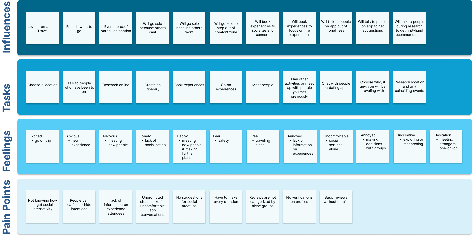
EMPATHY MAPPING & PAIN POINTS
I constructed an empathy map, allowing me to pinpoint specific pain points. These ultimately distilled into a lack of options for socializing AND the absence of a verification process, prompts, or suggestions within the available options.
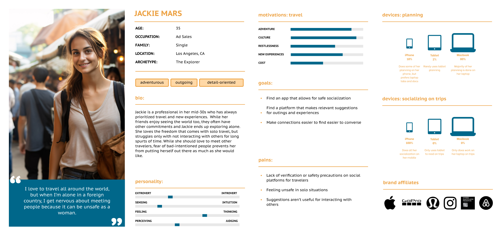
PERSONA
A persona was created to helps empathize by understanding their users' business and personal contexts.

COMPETITIVE ANALYSIS
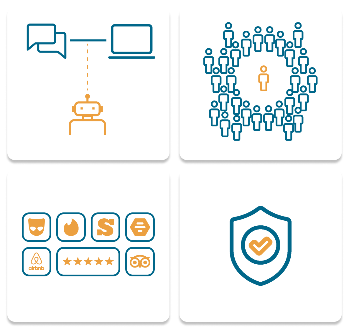
Conducting a SWOT analysis of 4 diverse companies – two in the social app space, on in AL, and the last in activities – revealed that while each excelled in their respective domains, there was a notable lack of crossover, creating potential drawbacks. For instance, social apps were adept at fostering connections but lacked guidance on post-conversation activities. The AI app, excelled in crafting personalized itineraries but lack a social component. And Trip Advisor boasted a comprehensive activity database but fell short in helping users integrate those activities into an effective itinerary.
PROBLEM STATEMENT
Solo travelers ages 25-45 need a SAFE platform to help them find like-minded travelers, so they can make lasting memories with new “vacation friends.”
I chose 25-45 because, while older travelers are still going out and exploring, many of these people choose to do full sightseeing tours instead of creating their own adventure. Furthermore, studies show that people are having families later so individuals in their 30s are having more disposable income and are using it to travel.
OPPORTUNITY STATEMENT
GoSolo has the potential to introduce a mobile platform that not only fosters social interactions during solo trips, but also utilizes AI and matching algorithms to recommend optimal group and individual meetups for travelers.
- SOLUTION -
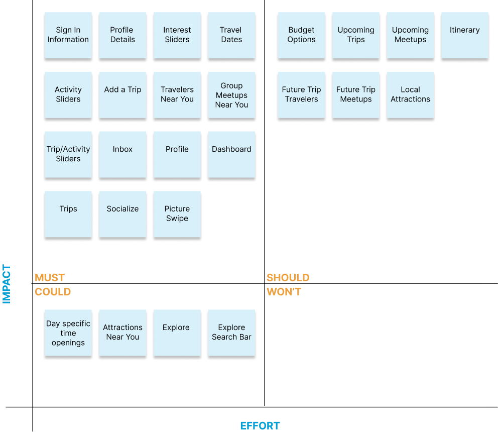
SITE MAPS & FEATURE PRIORITIZATION
Leveraging the strengths and weaknesses identified, I developed an initial feature map and establish priorities using the MoSCoW Method. This approach was guide by the insights and pain points uncovered in my research, notably the necessity for verification, the absence of prompts and suggestions, and the inclusion of personal reviews.
USABILITY TEST: ONE-CLICK
I focused on the first-click experience to evaluate the initial navigation for my first Usability Test. Participants were given the bottom navigation and 10 task to complete.
Results: Among the 3 participants, only one successfully completed all 10 tasks. The feedback from the other two participants highlighted issues with the bottom navigation names, particularly the term “socialization,” and confusion about where certain items would be located in. In response, I renamed socialization to “inbox,” prompting a reconfiguration of the feature map to address the other concerns.


SITE MAPS & FEATURE PRIORITIZATION
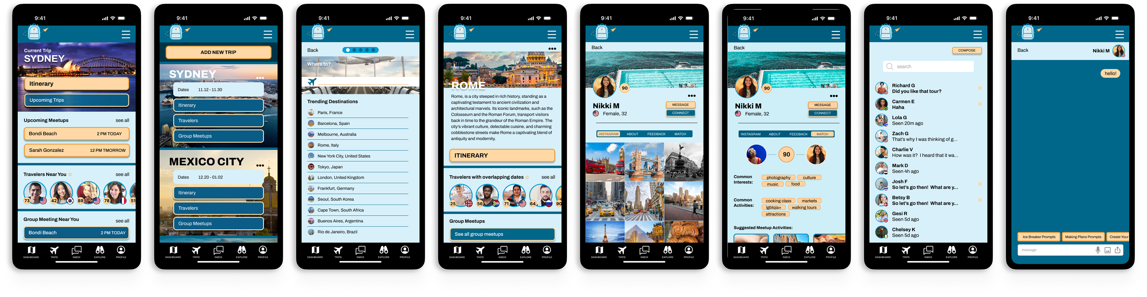
I created a new Usability Test using a mid-fidelity prototype to further test navigation. Each participant was given 2 parts to complete. Success metrics were determined by time, scenario completion, and non-critical errors. Tests were moderated in-person, with questions asked post-completion.
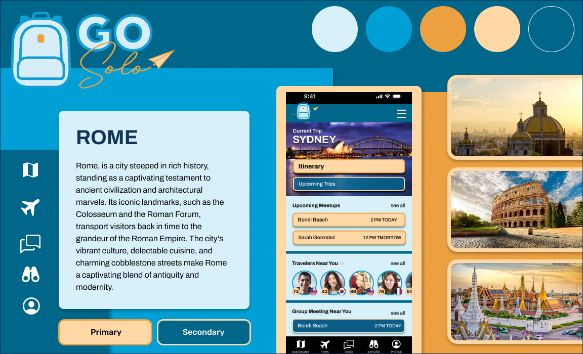
Task 1: Users must first add a new trip into the app. This trip will be to Rome, Italy from Feb 16-Feb 20.
Task 2: Once the trip is created, participants must identify a traveler with overlapping dates with a 90% or higher match and send them a quick “hello” message.
Results: 3 participants took this usability test, all ultimately succeeding, but encountering some delays due to the design. The first two found the placement of the “Add new trip” button at the bottom of the page confusing, as they got entangled in the content above. Both recommended relocating the button to the top. The last participant didn’t realize the capability to scroll over for “travelers with overlapping dates” due to the profile spacing and suggested making it more evident.

ART DIRECTION
In crafting the apps aesthetics, I opted for various shades of blue and orange, with blues representing freedom, inspiration and open spaces, and orange signifying fun, energy and happiness; together these colors mimic a sunset, which is one of the most photographed things while traveling. The chosen photos for the app were curated to showcase the beauty of destinations, intended to evoke excitement and anticipation among users for their upcoming trips.

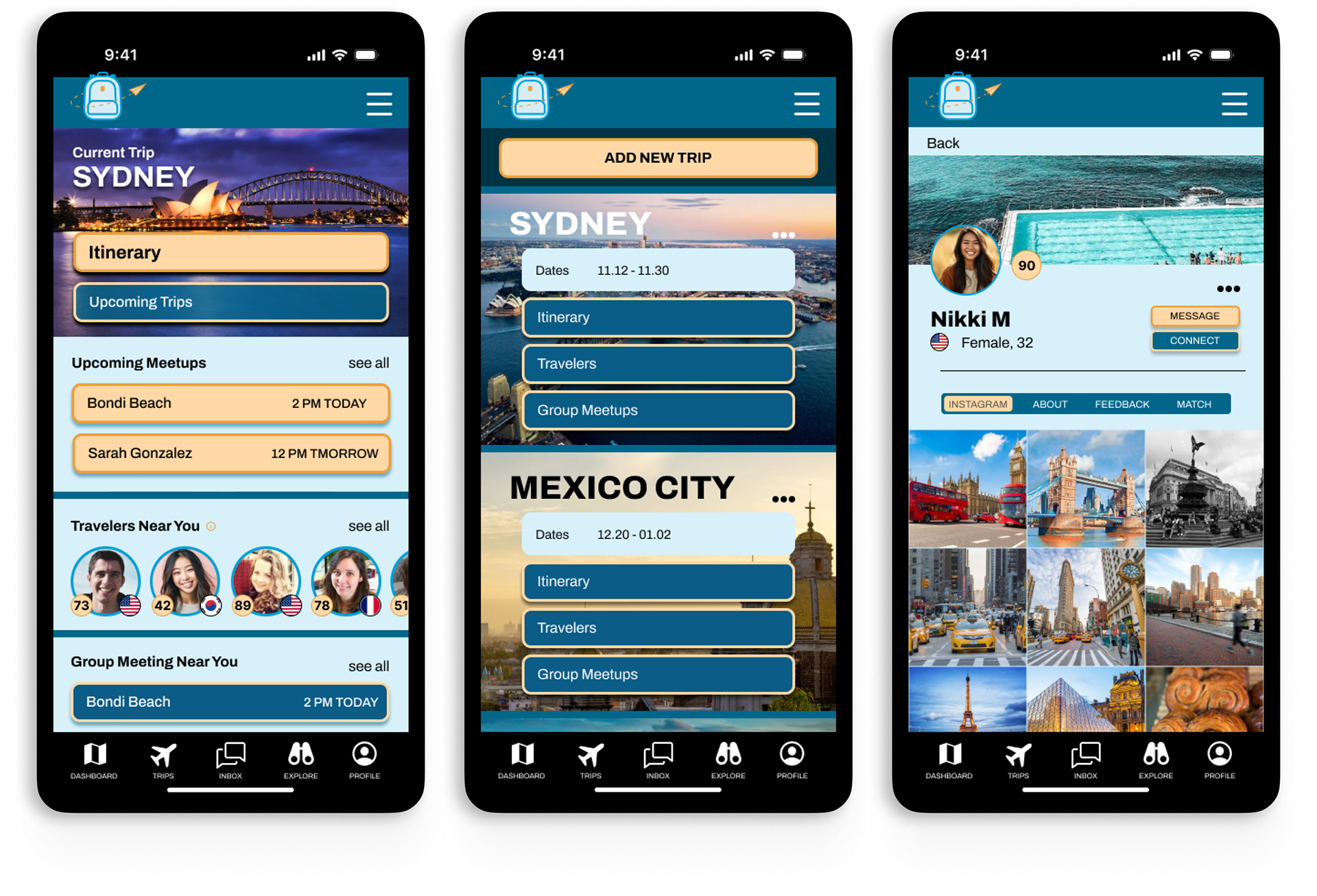
HIGH-FIDELITY PROTOTYPING
ART DIRECTION
Because of this severely accelerated timeline, there was not much time for user testing. I would recommend more usability testing, which could require more prototyping to be made for different task flows. From there, new iterations based on the testing results would be created and the pattern would repeat.


